Excel Tutorial 1
Jason Harlow
Task: Make a plot of the voltage versus
current data for a 200 Ω resistor, and fit a straight line to it.
Imagine you have a circuit which
contains a 200 Ω resistor, and you want to confirm Ohms Law by measuring
current and voltage. You set up a DC
voltage across the resistor which you vary from 0.1 to 20 mV. You set up an ammeter which reads the current
through the resistor at all of these voltage settings. Your data are:
| V (mV) |
V error (mV) |
I (μA) |
I error (μA) |
| 0.1 | 0.05 | 0.39 | 0.05 |
| 0.5 | 0.05 | 2.59 | 0.05 |
| 1 | 0.05 | 5.04 | 0.05 |
| 1.5 | 0.05 | 7.4 | 0.05 |
| 2 | 0.05 | 9.7 | 0.05 |
| 4 | 0.05 | 20.52 | 0.1 |
| 6 | 0.05 | 30 | 0.1 |
| 8 | 0.05 | 41.55 | 0.2 |
| 10 | 0.05 | 51.07 | 0.5 |
| 12 | 0.05 | 62.9 | 1 |
| 14 | 0.05 | 66.5 | 2 |
| 16 | 0.05 | 78 | 2.5 |
| 18 | 0.05 | 91 | 3 |
| 20 | 0.05 | 98 | 3 |
- Make a data file. Save the data in a
text file, r200ohm.txt, with tab-delineated columns. That means that each line of the text file
has four entries, and after each entry there is a TAB. Many data taking programs, such as Labview,
output this type of file, and you can import it quite easily into a spreadsheet. You can download the data here: r200ohm.txt
- Read the data file into Excel. Start Excel, click on File / Open. Select the correct directory and click on
Files of type: All Files (*,*). Click on
r200ohm.txt and click Open. This should
open a new window which will ask you some questions about the file. It is Delimited, you can start import at
row 1, the delimiter is Tab, and Column data format is General. You should now have the above numbers in your
spreadsheet from cell A2 to D15.
- Make a chart of the data. Click on
 , the
Chart Wizard Icon. Choose XY (Scatter)
plot, with points but no lines. Data Range doesnt really matter; it can
be all the text. Series is very
important, you must modify these. There
should only be one Series. For Name, put
200 Ohm Resistor Data. For X Values,
click on the little
, the
Chart Wizard Icon. Choose XY (Scatter)
plot, with points but no lines. Data Range doesnt really matter; it can
be all the text. Series is very
important, you must modify these. There
should only be one Series. For Name, put
200 Ohm Resistor Data. For X Values,
click on the little
 icon beside the line, which will take your
mouse back to the spreadsheet to highlight a set of x-values. Left-click and drag over cells A2-A15, the
voltage values, then hit Enter. For Y
Values, click the
icon and highlight cells C2-C15, the current
values, then hit Enter. You should
remove any other Series the Wizard automatically creates. For titles, you can choose V (mV) for Value
(X) axis, and I (micro-A) for Value (Y) axis. Remove the Gridlines and do not Show legend. Add the chart as an object in the sheet you
are working in. Once you have a chart,
you can right-click in the centre of the area, click Format Plot Area, and
choose a white background.
icon beside the line, which will take your
mouse back to the spreadsheet to highlight a set of x-values. Left-click and drag over cells A2-A15, the
voltage values, then hit Enter. For Y
Values, click the
icon and highlight cells C2-C15, the current
values, then hit Enter. You should
remove any other Series the Wizard automatically creates. For titles, you can choose V (mV) for Value
(X) axis, and I (micro-A) for Value (Y) axis. Remove the Gridlines and do not Show legend. Add the chart as an object in the sheet you
are working in. Once you have a chart,
you can right-click in the centre of the area, click Format Plot Area, and
choose a white background.
- Add error bars. How can
you have a plot without error bars??< To add them, left-click on one of the little diamond-shaped data points,
which will make them all light-up. Then
right click to get a drop-down menu, and select Format Data Series (this takes
a bit of manual dexterity with the mouse). Click the X Error Bars tab, select Custom, click the
icon beside the + line, left-click and drag
over cells B2-B15, and hit Enter. Do the exact same thing for the line. Then click the Y Error Bars tab, select
Custom, click the
icon beside the + line, left-click and drag
over cells D2-D15, and hit Enter. Do the exact same thing for the line. Click OK, and you should now have some error
bars on your plot. (They are kind of
small in this case.)
- Add a trend line. Lets put a straight line through these
data. Left-click once on the chart so
that it has little black squares around its edge, meaning it is selected. Click Chart / Add Trendline. For Type, select Linear, for Options, check
Display equation on chart and Display R-squared value on chart. Click OK.
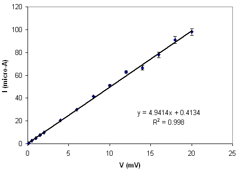
Well, now you have a preliminary
graph. You also have some estimate for
the slope. I got m=4.9414 μA/mV, or
4.9414×10³ inverse-Ohms. That means the estimate for the resistance is 202.4 Ω, which is
pretty good. But this is not a final
result! It would make a nice preliminary
plot to convince you that you are not doing something wildly wrong, but here
are some problems:
- Excel does not produce an error in the fitted
slope, and therefore I was not able to estimate the error in resistance.
- Excel does not
take into account error bars when creating this trendline. The points are weighted equally in the least
squares fit, regardless of the size of their error bars. When you use a proper fitting package, χ2
is minimized, which is mathematically equivalent to a least squares fit in
which the residuals are weighted by the inverse square of the errors in the
data points. Add Trendline does not do
this.
- χ2
is not computed. So we dont have any
idea how good the fit is, or whether our errors seem to represent expected
statistical scatter.
What is R2?
R is the Coefficient of
Correlation. Correlation means that the
y-values tend to increase as the x-values increase (positive R). Anti-correlation means that y-values tend to decrease as x-values
increase (negative R). Perfect correlation corresponds to R=1, meaning that y is directly proportional to x,
and a straight line is a perfect fit. Excel only reports R2 for some reason, so you cant tell if its correlated
or anti-correlated. But keep in mind R2 has nothing to do with χ2! It is a fairly useless number, which does not
take into account error bars (of course!).
Here are the
equations for some typical statistical variables when you have a set of N ( x,y)
pairs with no errors:
- Mean of x:

- Mean of y:

- Standard deviation of x:

- Standard deviation of y:

- Coefficient of Correlation:

Back to Excel Hints.