Microsoft Excel Hints
How to use Microsoft Excel to make preliminary plots of scientific data
Jason Harlow, June 2005
Excel is a popular spreadsheet which is already installed on
many students computers. It is
primarily designed for accounting offices and businesses. There are many other programs much better
suited for graphing and analyzing scientific data, such as Mathematica,
Matlab, Maple, Origin, pro Fit (for Mac only), and LAB
Fit. Very few researchers in physics
ever use Excel.
That being said, Excel can be used to make preliminary plots
of data, and even quick statistical analyses. Here are some ways you can make pretty graphs with Excel, and how you can use it to even compute χ2. There are also warnings of shortcomings which should remind you that other, better software packages can make your life much easier.
Here is a detailed method of how to use Excel to complete
the following tasks:
|

|
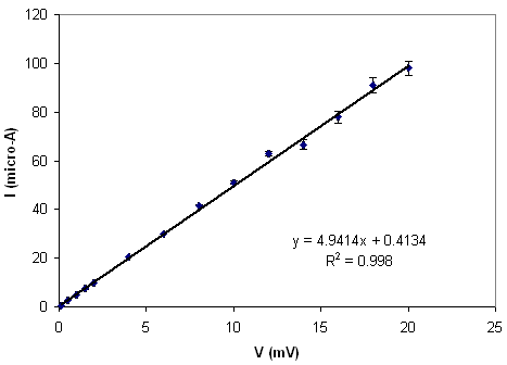
1. Make a plot of the voltage versus current
data for a 200 Ω resistor, and fit a straight line to it.
The fit is done with the Add Trendline function, and, unfortunately, does not take into account error bars. The points are weighted equally in the least squares fit, regardless of the size of their error bars.
|
|

|
2. Plot the gamma-ray spectrum of an emission
line source, and overplot a Gaussian on it.
This Gaussian is not a Trendline
but an actual equation with parameters the user can vary. The χ2
for the data compared to the Gaussian fit is computed. By varying the parameters manually, the
user can try to minimize χ2. This is something which is done automatically by better fitting packages.
|
NOTE: For these tutorials, I used Microsoft Excel 2002, run
under WindowsXP. I did not use the Data Analysis Add-In toolkit. If you have any
suggestions or comments about this page, please contact me. Contact information is listed on my web site.
Return to Advanced Undergraduate Laboratory

