Excel Tutorial 2

Jason Harlow

Task: Plot the gamma-ray spectrum of an emission line source, and overplot a Gaussian on it.

Imagine you have a radioactive source and a Gamma Ray detector, and you take a spectrum of the source. There is some Cobalt-60 in the source, and it emits gamma rays with an energy of 1173 keV. The spectrum is a plot of photon energy versus counts, or number of photons detected. No errors are given for either variable, but it is assumed that photon energy is known precisely, and the error in the counts is the square root of the number of counts. There should be 100 rows of data; the first few lines should look like:

E (keV)Counts
1171 11
1171.05 6
1171.1 16
1171.15 11
1171.2 8
1171.25 10
1171.3 14
1171.35 11
1171.4 9
1171.45 11
1171.5 13
1171.55 12
1171.6 11
1171.65 10
1171.7 10
1171.75 11
1171.8 14
1171.85 6
1171.9 5
1171.95 11
1172 14
  1. Make a data file. Save the data in a text file, co60.txt, with tab-delineated columns. That means that each line of the text file has two entries, separated by a “TAB”. You can download the data here: co60.txt
  2. Read the data file into Excel. Start Excel, click on File / Open. Select the correct directory and click on Files of type: All Files (*,*). Click on co60.txt and click Open. This should open a new window which will ask you some questions about the file. It is “Delimited”, you can start import at row 1, the delimiter is Tab, and Column data format is General. You should now have a lot of numbers in your spreadsheet from cell A2 to B101.
  3. Make a chart of the data. Click on , the Chart Wizard Icon. Choose XY (Scatter) plot, with points but no lines. Data Range doesn’t really matter; it can be all the text. There should only be one Series. For Name, you can put “Cobalt 60 Spectrum”. The x and y ranges are probably automatically set, if not, set them. For titles, you can choose “Energy (keV)” for Value (X) axis, and “Counts” for Value (Y) axis. I tend to remove Gridlines and I do not Show legend. Add the chart as an object in the sheet you are working in. Once you have a chart, you can right-click in the centre of the area, click Format Plot Area, and choose a white background (I hate the grey it chooses.).
  4. Add error bars. When you count an integer number of photons arriving randomly but at a fixed average rate, the minimum error in the total number of counts is the square root of the number of photons counted. In column C, we will add the uncertainty in counts. Left-click on cell C2. Type “=sqrt(B2)” and hit Enter. Left-click on cell C2 again, and hit control-c for “Copy”. Left-click and drag on all the cells below it, from C3 to C101, then hit control-v for “Paste”. This will paste the formula into all of these cells, which should now contain errors. To add error bars to the chart, left-click on one of the little diamond-shaped data points in the chart, which will make them all light up. Then right click to get a drop-down menu, and select Format Data Series (this takes a bit of manual dexterity with the mouse..) Click the Y Error Bars tab, select Custom, click the icon beside the + line, left-click and drag over cells C2-C101, and hit Enter. Do the exact same thing for the – line. Click OK, and you should now have some error bars on your plot.
  5. Create a Gaussian column. The equation for a Gaussian is: , where y is the number of counts, x is the energy, B is the background, A is the amplitude of the peak of the Gaussian, μ is the energy of the peak, and σ is the standard deviation of the function, which parameterizes the width of the peak. To create a Gaussian which fits closely to the actual data, we must first make guesses for each of these parameters.

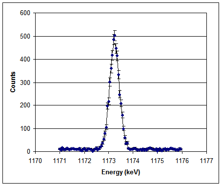
    As first guesses, in cells H1, H2, H3 and H4 enter the values 10, 500, 1173.2 and 0.5. Now use these values in an equation. Click on cell D2 and enter:

    = $H$1+$H$2*EXP(-1*(A2-$H$3)^2/(2*$H$4^2))

    The dollar signs around the letters of the cell names make these absolute references. That way, when you copy and paste the formula, these will remain the same, and Excel won’t try to find the values in the rows below. Do NOT put the dollar signs around the A in A2, since you want this to be pasted as A3, A4, A5, etc. Left-click on cell D2, copy it, then paste it into cells D3-D101.

  6. Add this Gaussian line to the chart. Left click on the chart area. Right click for a drop-down menu, and select Source Data. In the Series tab, click Add. In the line beside X Values, click the icon, then highlight cells A2 to A101, then hit Enter. In the line beside the Y Values, click the icon, then highlight cells D2 to D101, then hit Enter. Then click OK. You should now have a new, smooth set of symbols. Left-click on one of the symbols, then right click for a drop-down menu, and select Format Data Series. Click the Pattern tab. For Line select Automatic and a black colour. For Marker select None. Click OK.
  7. Compute residuals for this fit, and χ2. In E1, type =B2-D2. This is the residual of the data minus the fit, or actual minus expected. Left-click on cell E2, copy it, then paste it into cells E3-E101. In F2, type =E2^2/C2^2. This is the χ2 contribution of this point. Left-click on cell F2, copy it, then paste it into cells F3-F101. In G5, type chi-squared=, and in H5, type =SUM(F2:F101). This is χ2 for the Gaussian line, compared to the data. If you did everything as above, you should get a χ2 of 65,379. This is to be compared with 100-4, the number of degrees of freedom, or 96. You can tell by looking at the graph that this is a terrible fit, probably because the sigma value I chose was way too high: the peak is too fat. The poorness of the fit is reflected in the high value of χ2.
  8. Adjust the parameters of the fit to reduce χ2 and improve the look of the chart. You can now play with the numbers in cells H1-H4 to try to improve the fit and get a better χ2 value. I found that 10, 460, 1173.24 and 0.2 improved my χ2 to about 122, which is comparable to the expected best value of 96. Consulting a chart of chi-squared probability shows a probability of about 4% that this model would produce data with a chi-squared higher than this. In an exactly typical run, chi-squared probability should be 50%, so perhaps our model could still be improved.


Back to Excel Hints.